Yes, indeedy, the mad quilt scientist (who even has her own hashtag, 'cause she's just that cool) has been busy in the basement again.
The stationary tub has been cured. Oh, my, but water slurping down a drain as it should is such a lovely sound.
To catch up on dye progress since my last post on the subject...get ready for a boatload of pictures! (Some of the pics are singles, others are galleries. The galleries are set to autoplay but also have controls so you can move through them at your own pace. If you're getting this by email and the galleries don't work, you may have to view it on the website.)
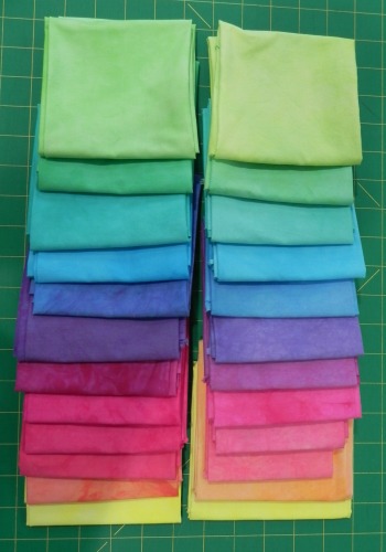
This time I re-did the pastel version of the gradations from the Frieda Anderson class in Lancaster (and her book). The Lancaster ones are on the right, the new ones are on the left.
Just as in the first gradations re-do, most are about the same but a couple of colors vary pretty significantly. And, just as in the first gradations re-do, there are oh so many possible reasons why.
I do think I didn't dilute my concentrate quite as much as we must have in Lancaster, since mine aren't quite as pastel-y. But I'm quite okay with that.
Still n' all, I like what I ended up with, so all's fair in the world of hand-dyeing.
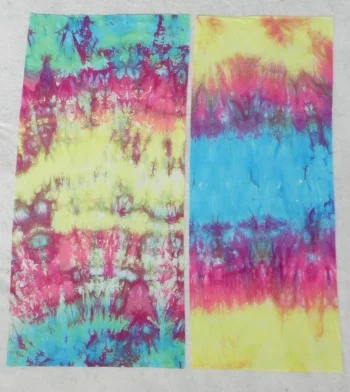
Then I did a different kind of gradation--gradation all on one piece of fabric.
I'd taken a picture of these in their dye baths so you could see the before-n-afters, but can't find the picture now. Sorry about that. I did sort of a loose pleat on one and a scrunch on the other, folded them in the middle to get them to fit the container, and laid them lengthwise. Then I poured three different colored dyes on them in sections--one in the reverse order of the other. These were still the pastel (diluted) versions of the dye concentrates--turquoise, fuschia, and yellow, which is why they look a little washed out. They're half-yard lengths, if you're curious. Don't even ask what I'll do with these. No idea, but that's not really the point for me!
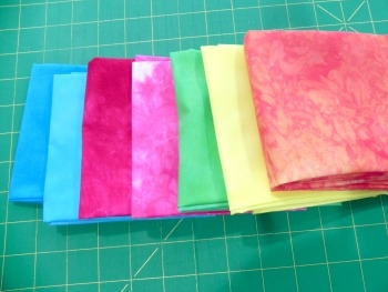
And here's a gallery of other random bits I dyed trying to use up the rest of this set of dye concentrates so I could move on. I included the picture of one in the dye bath--it's a great example of how some colors are quicker to move into available space than others. That turquoise, he's an aggressive little fella. "Me first! Me first!"
And there was evening and there was morning, the second day. (Well, okay, a few "second days" later.)
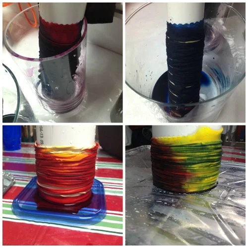
This past weekend, I finally got myself over to Lowes to ask if they had the equivalent of a remnant bin of PVC pipes. I only needed sections about 12" or so long, and didn't want to ask them to cut that length off several different widths. I was hoping they'd have a scrap bin or something. Some of you may already have your eyebrows raised. "Has this woman never bought PVC pipe before?" Nope. I've now learned that home stores routinely carry 2-foot lengths of certain widths to be used as couplings or whatever. I am now the proud owner of four PVC pipe tubes ranging in diameter from 1 1/2" to 4". Whee! I was finally ready to do some shibori!
Shibori has all sorts of facets to it (I own this book for future playing), but what most people are familiar with is wrapping fabric around a cylinder and either tying it tightly with string or using rubber bands. The wrapped fabric then gets shoved down to the bottom of the cylinder creating a number of folds. When it's dyed, the folds create visual texture.
I was using Mixing Red, Lemon Yellow, and Deep Navy Blue on this one. The navy blue is a new dye for me so I wasn't sure how it would behave. Turns out, it's just as aggressive, if not more so, than the turquoise.
Here's a photo of the shibori dye bath.
And that turned into these...
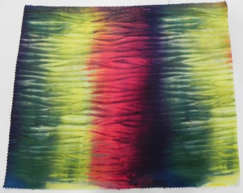
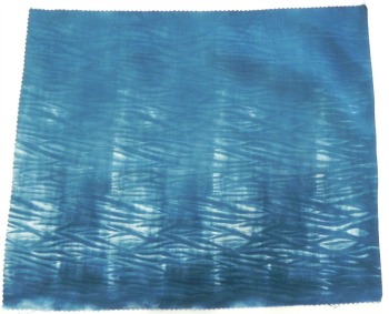
I did one with just the navy blue because I wanted sort of an indigo effect. However, due to it's aggressive nature, the blue paid very little attention to the resist of the rubber bands so the resulting shibori pattern is very subtle. I like it, but next time I'll dilute the dye more so perhaps it becomes a little more humble in its approach.
And then I went back to my ice-dyes. As I've mentioned before, ice-dyeing is the best way to break a compound color to see all the colors that go into making it. I decided to ice-dye my two black dyes (628 and 629) side-by-side to see if, by breaking down the colors, I could see a difference.
Here's 628.
Kind of fun to see all the blue, yellow, and a bit of red appear here and there!
And here's 629.

According to ProChem's website, 628 is more of a blue-ish black, and 629 has more of a green cast to it. They were described to me as one being a bit warmer and the other a bit cooler. I've yet to use either in a circumstance in which it seemed to make a difference, but I haven't really pushed the envelope yet either.
Going back in time a little bit: The weekend before last we had a spring snowstorm. Not altogether unusual around here, though the 11" in my backyard the next morning was pushing it, in my opinion. I decided to find the silver lining and did some snow dyeing.

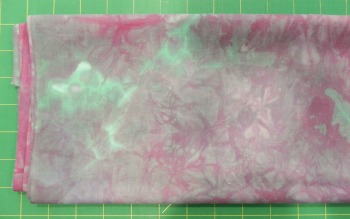
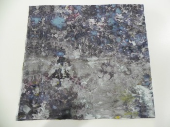
Yummy. Love this one. I used Stormy Grey, Old Rose, Camel, and Ecru (ProChem names) because I thought these neutrals would break in interesting ways. I was right!
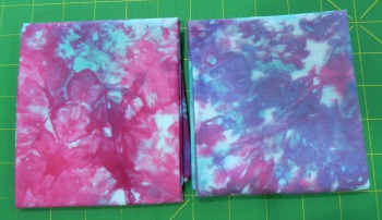
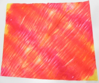
Next up, turquoise and fuschia. This one didn't have as interesting a result because (1) turquoise and fushchia are pure colors so nothing breaks and (2) they were the leftover pastel versions of the dye concentrates I'd mixed, and with the snow, they just became even more dilute. Still, pretty enough...
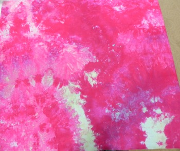
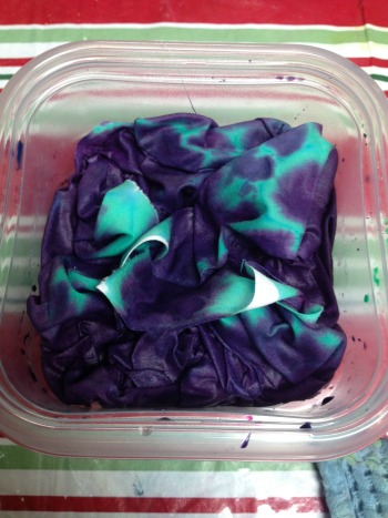
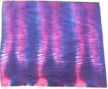
And, for the last bit of snow-dyeing, I went back to my standard favorite mix: teal and purple. I just can't stay away from these--different results every time but always gorgeous!

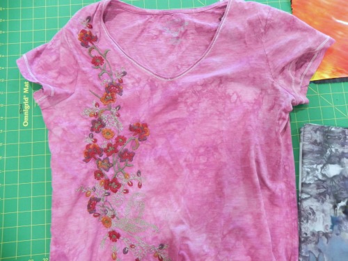
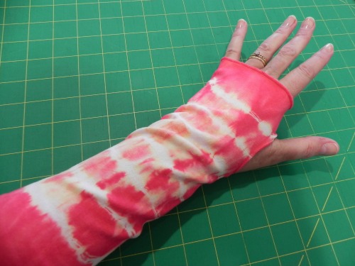
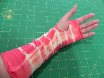
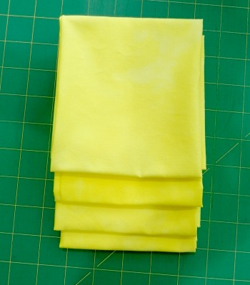
And the last little gallery--all the other bits I tossed into dye baths. Some more yellows since I'm working on "luminosity" for my design study group (although after this I found something else that's just PERFECT to use for that homework assignment...but I'll keep that under my hat until later); a tshirt of mine that had gotten stained so I tossed it into a dyebath of colors I had handy, not overly worrying about whether the color would work with the embroidery; and my first test run of wrist warmers. Which I love and have been wearing for the last two days, so I'll definitely be making more of those!