It's been awhile since I've posted about a journal quilt, so let me recap: My 2015 Quilty Resolution was to do one journal quilt per month. In my definition, a journal quilt is a small project (approximately 8"x10") that allows me to experiment with a technique, a theme, a color scheme, or whatever. My main focus is on experimentation (my 2015 word of the year).

January's journal quilt was Sunset in Bagan, in which I was experimenting with netting.

I had to cut myself some slack on defining February's journal quilt. That whole month was experimentation! I was playing around with a lot of different design experiments based on having taken the art quilt class as well as some other things that caught my creative eye, as it were. So I decided that, rather than getting all legalistic on my own butt about how I was defining "journal quilt," I'd focus on the "quilt project that involved experimentation" concept, and thus declared Neumes my February journal quilt, despite the fact that it's quite a bit bigger than 8"x10".
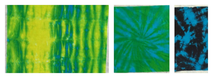
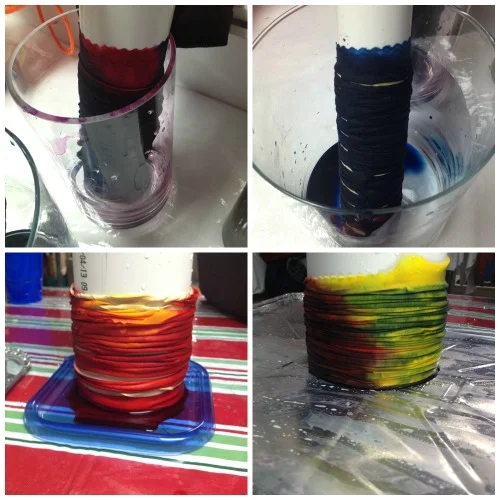
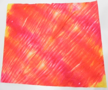
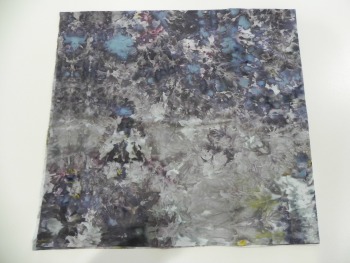
March was a very busy month, and I wasn't home much. But I was still experimenting. I did Cindy Walter's fabric painting class on Craftsy in March, and was just having all sorts of fun messing around with all the different types of fabric paints and inks I've amassed over the last couple of years. In her class, she showed a way to do an abstract paint design that brought back to mind my favorite way of coloring when I was in high school--basically just sketching random lines and shapes that connect together and then going to town with the color. I used to do a lot of this when I was a kid!
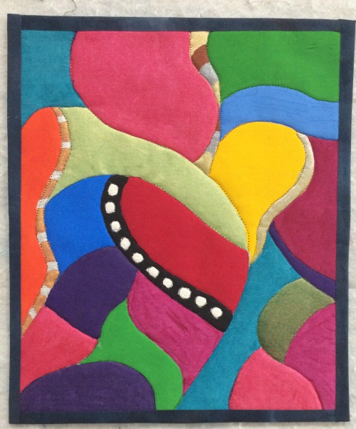
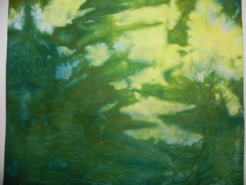
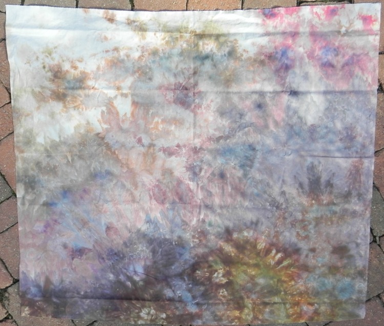
March Journal Quilt--just named "March Journal Quilt"
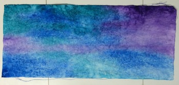
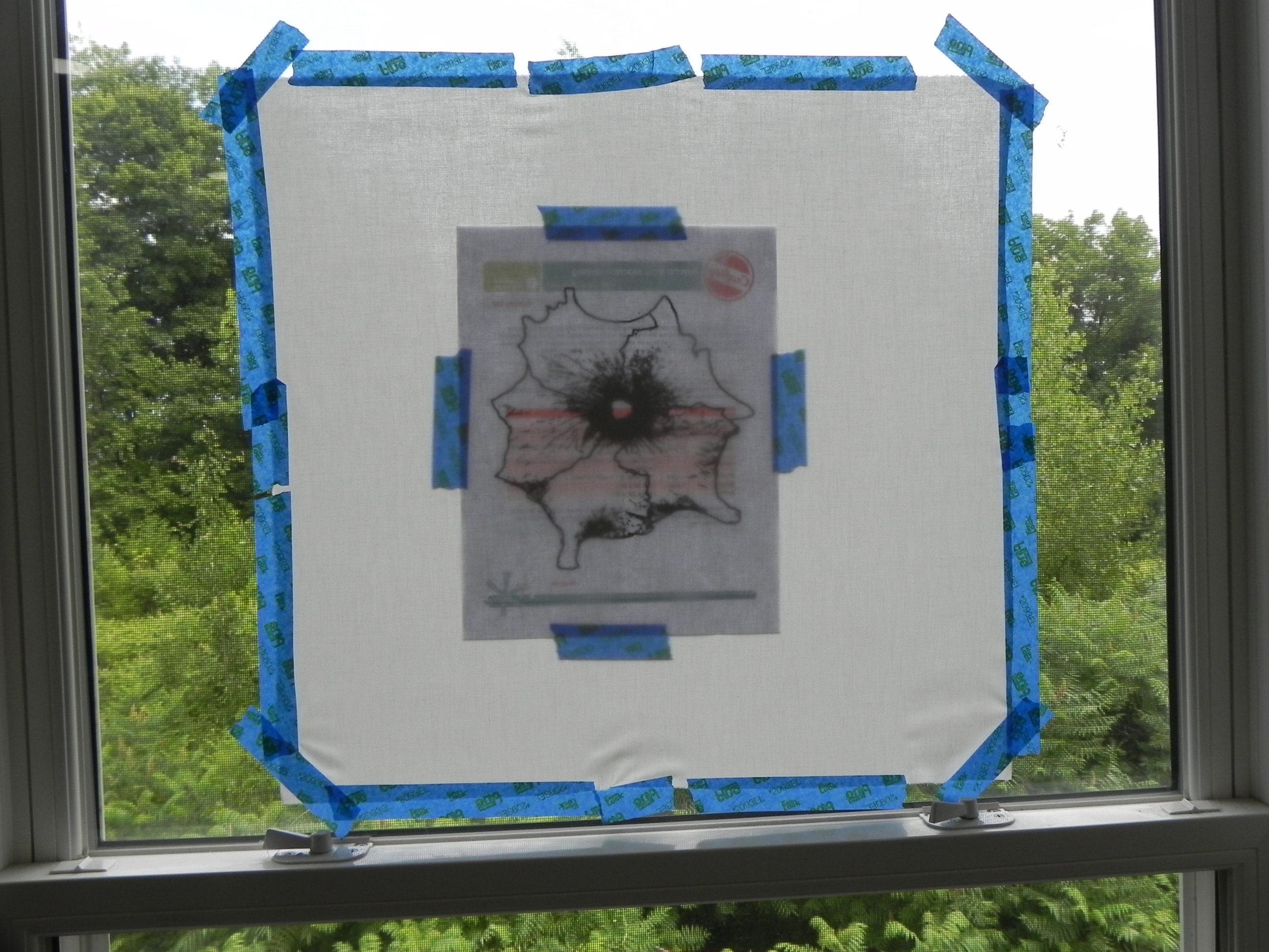
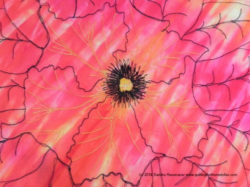
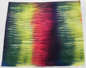
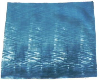
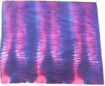
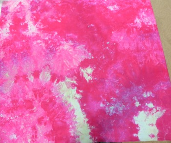
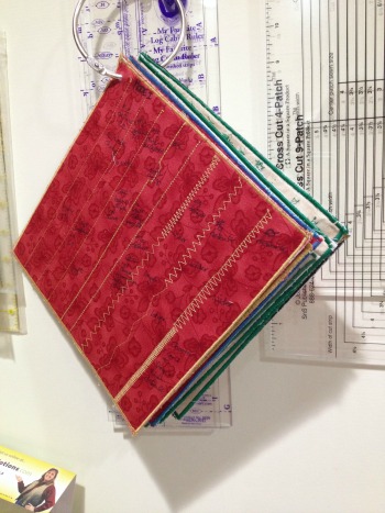
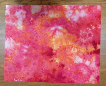
So, my nostalgic painting experiment became March's journal quilt. I'm pleased to announce it's finished! It measures out to 8 1/2" x 10" but that was happenstance--I was just using a spare piece of muslin I had on hand to do the painting and it happened to be almost journal quilt size--phew.
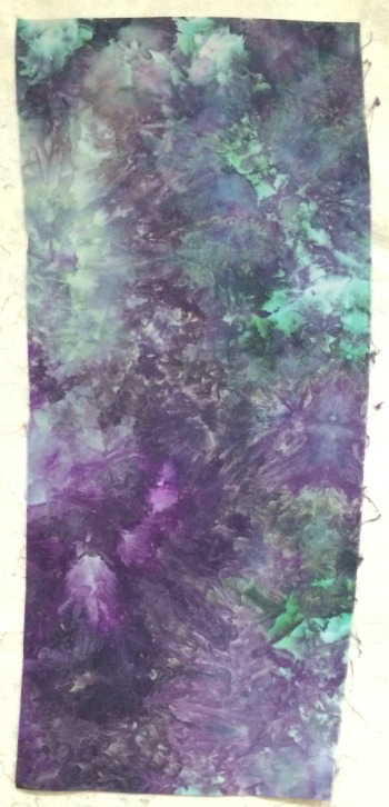
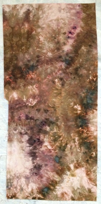
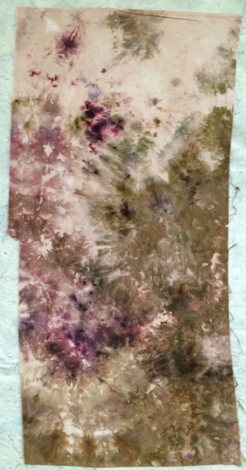
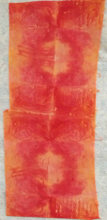
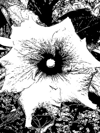
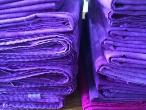
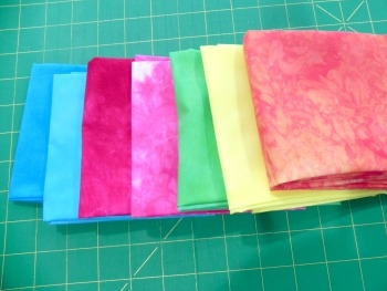
Please note that I did this without any concern for color scheme. My goal was simply to use every paint or ink I had on hand (except my Tsukeniko inks--those remain for another day). Thus: almost every one of the sections in this piece is a different paint. I had a couple of spaces more than I had paints on hand so I did repeat a couple, but probably not as many as look repeated in this photo; some were two different types of paint in basically the same color; another one or two were experimenting with a Pearl-X powder mixed into paint (the Pearl-X isn't showing up well on the photo); I started by mixing one of the purples and, when I was unhappy with the result, I went out and bought a pre-mixed purple that I liked much better so I also painted over the original yuckier one, and so forth. Still working on mixing colors--Joen Wolfrom is very helpful on that!
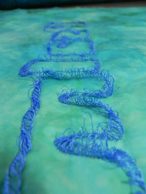
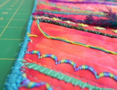
It took me until the end of April to finish this because (1) you have to let the paint dry and (2) you have to let it cure. All that can take 2-3 weeks, depending on how thick a layer of paint you have. Mine's pretty thick in some places. I sat down this past weekend to add the finishing touches: I used invisible thread to quilt along all the lines to make it look a little more like it was pieced or appliqued. For the most part, I was able to stay in the lines but don't look too closely at the yellow. (Besides, the yellow ended up having the stiffest hand when dried so the needle just poked holes right through it.) I just did a fast fused border using the remainder of my hand-dyed black fabric that I'd used for the backing. This will never go in a show so I didn't want to spend much time on binding.
I learned an absolute ton on this project. I've got a much better feel for what different types of paint are good for, things to consider when approaching a paint project, and so forth.
April's journal quilt may end up being another "cutting myself some slack" project as I'm still doing a lot of experimenting but not specifically on a journal quilt project. I suppose I could say that my journal quilt resolution has already served its purpose: I wanted to do it to encourage myself to experiment. So far, in 2015 I've been doing very little other than experimenting!