A Finish! Design Study Group Homework on Analogous Colors

My design study group is meeting tonight so I'm scheduling this post to go live after I'm already at the meeting...so thanks to the wonders of technology you'll get the "reveal" at the same time they do.

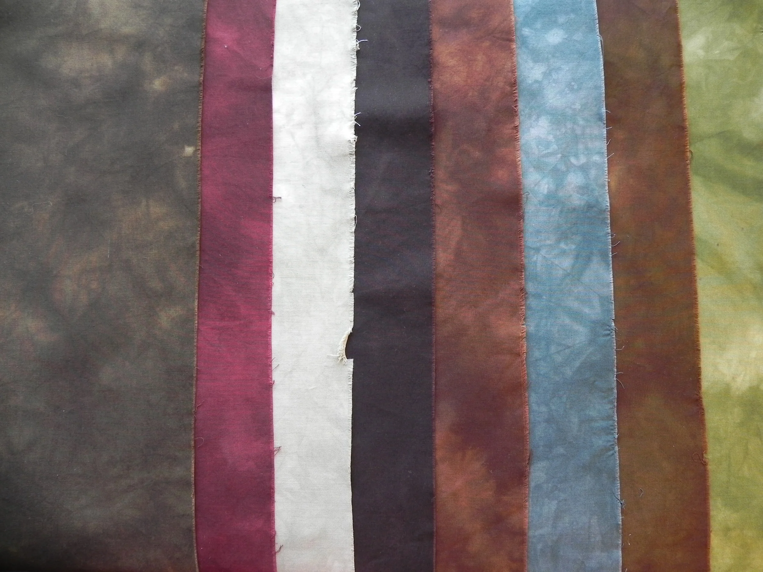
Our group is currently working with A Fiber Artist's Guide to Color by Heather Thomas, going through one workshop a month. For this month's meeting tonight, we were to do something using analogous colors, while also keeping in mind all the other design principles of balance, unity, repetition, and so forth.

peruviantoad.jpg

On one of my vacation days in December I took myself on an artist's date to our local art gallery and planned on studying such things as use of light, color, line, texture, and other things I could carry into my quilting.

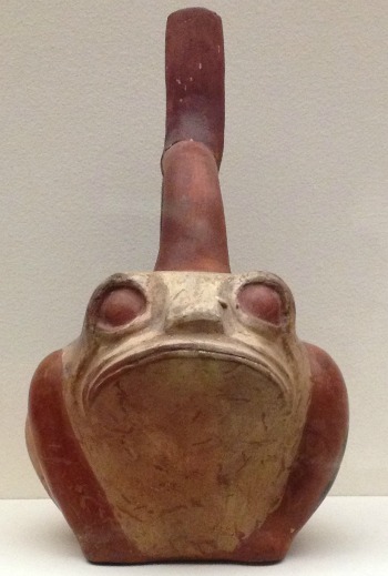
While in the ancient art section, I fell in love with this guy. I just knew he'd end up in a project somewhere.

His face is just too funny.


peruviantoad2.jpg


He's a "Stirrup spout vessel: frog," from the Moche culture of the north coast of Peru, circa 300-450 CE.

Later, when I was pondering what I might do on analogous colors, I decided to challenge myself to use only 2 1/2" squares already cut in my scrap bin, plus hand-dyes if I chose. Once I made that decision, a design popped into my head.


Yep, Mr. Froggie-Fella was part of the design. Here is the end result.

FrogFellaProject2014.jpg
Photo Jan 27, 8 37 36 PM.jpg

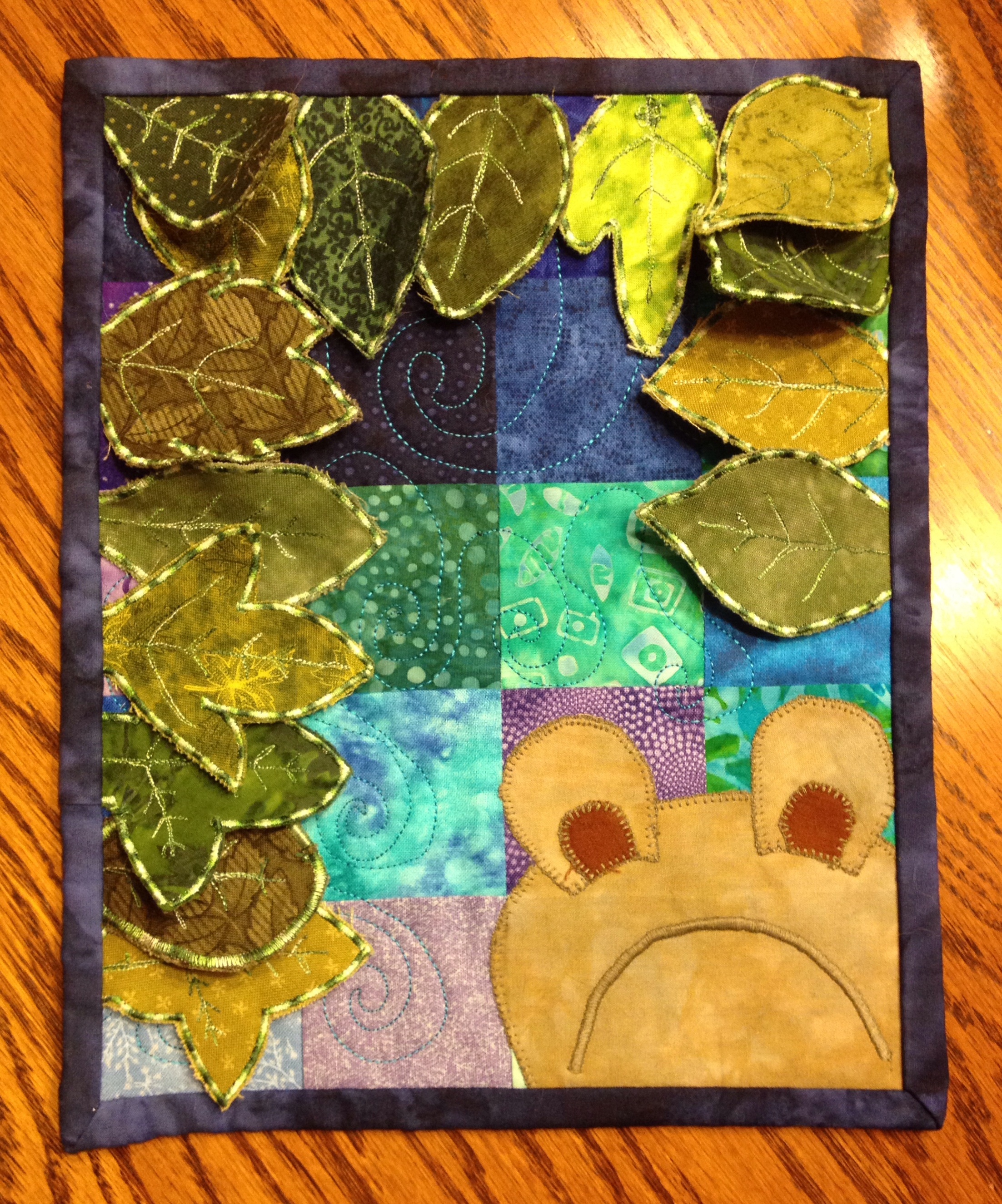
I also had fun figuring out how to make the 3-D leaves. I've seen a lot of techniques for doing it in magazines, in blogs, and in classes; I've done some similar dimensional work before. I tried out a couple of different methods before finding a technique that worked well for this project. Different techniques apply themselves to different circumstances.


Photo Jan 27, 9 20 57 PM.jpg

But you've just gotta love that face, don't you?

(If you're curious, Frog Fella is made out of my hand-dyes and a thread that matched amazingly perfectly.)

Although it doesn't have an official name, I've found myself thinking of this as the Frog Fella Project.


Photo Jan 26, 9 42 57 AM.jpg

By the way, I did also make that chocolate babka from the Artisan Bread class that I'd mentioned. Yum.

No, that's not burnt on the top there. That's all nummy nummy dark chocolate.

Godiva dark chocolate chips.

60% cacao.

Can you tell I'm a fan?


Let There Be Light (and Color!)

My sewing room and home office are in one space (as well as my husband's computer, and formerly the kids' computer until they left home and I kicked it out!). It's a nice, big room--the bonus room over the garage--but it's pretty narrow and although it's got a nice big picture window at one end, it faces east so I get great sun for about two hours in the morning and then it gets progressively darker for the rest of the day.

And let's not even talk about November to March, when we're lucky to get even 10 minutes of actual sunlight in a day.  

My new lights ended up, just by a happenstance of scheduling, becoming a day-after-birthday gift to me. And what a birthday gift.

Before... 

Lighting-before.jpg

This was taken at 9:00a, when I should be getting the most light of the day. It was a gray, dreary day, so this is actually what I normally dealt with most of the late fall through early spring. (Yes, I blurred out the office side--you can see the sewing side.)

Note the number of floor lamps and table lamps trying desperately to give me working light. I'm standing right next to my design wall--the darkest corner furthest from all lighting available. Also note how yellow everything is. I had an Ott light at my cutting table and would have to pull fabric off the shelves and lay it under the light so I could see what color it really was.

After... 

lighting-after.jpg

Taken later the same day. It looks brighter outside just because it had stopped raining, but it was still just about as gray as it was in the morning. All the light you see is now electric. 

I had them install bulbs that were as natural-daylight-colored as possible. My fabrics look fantastic. The electrician really worked to figure out the best placement and number of lights to minimize shadowing when I'm at my cutting table. They're "cool" lights so they don't heat the room up at all.  

And, best thing--there's one right near my design wall. 

I can see!!!!  Woohoo woohoo woohoo!!! Serious happy dances up in here.

Best thing? I'm getting rid of the table lamp that's been taking up space on my cutting table for years! (I'll still keep the floor lamps around until I experience the room through all times of day and a few more months of seasonal light changes, but I think I'll eventually be able to ditch one or two of those too.) 

And, as another happenstance of timing to feel like it's a birthday present to myself, two color wheels I'd ordered from Dharma Trading came today. These are designed especially with fabric dyeing and painting in mind. 

cmyk-wheel-front.jpg

This is a "CMYK" wheel. Some dyes/paints apparently work better if you use the CMYK wheel when figuring out dye combinations rather than the traditional wheel. Joen Wolfrom also prefers to use this color wheel in general--her 3-in-1 Tool is based on it.

I like that it has percentages for mixing. If you look below the red where it has the tones, it has percentages written along the sides. In other words, if you create a dye solution that's 90% the pure color (red, in this case), and 10% of it's complement (cyan), you'd get the first color down from the red. If you have an 80/20 proportion, it's the next color lower, 70/30 is the next one down, and 60/40 is the lowest one. See? (Did you know that? Mix a color and it's complement and you work your way towards gray! )

CMYK-wheel-back.jpg

The back of the CMYK wheel has another very helpful tool in determining proportions.

Look under yellow. If you mix 80% of the pure color (yellow) with 20% white, you get the tint--which is the lighter swoop on the left. If, on the other hand, you mix it with 20% black, you get the shade, which is the darker swoop on the right. Next one down is 60/40, next is 40/60, and lowest one is 20/80.  

The graphic in the middle also gives you at a glance what the complement, split complement, triad and tetrads are, plus it shows analogous along each side of your chosen color.  

color-mixing-wheel-front.jpg

The second wheel I got is based on the traditional color wheel, but it has another very useful tool for choosing dye combinations.

Look at red, center top. You spin the wheel to see what color you would get if you added the colors at the top of the inner wheel. In this case, I've spun it to show what would happen if you added blue to red--you get the color in the window (which is violet). It may seem straightforward, but it's particularly useful in the tertiary colors. In other words, what's the difference between adding blue to orange, versus adding blue to yellow-orange? It will allow me to more easily fine-tune my color recipes. 

color-mixing-wheel-back.jpg

The back has the tints, tones, and shades again, with the graphic in the middle giving a quick-glance visual of complementary, split complementary, triads and tetrads of any chosen color.

So while there are a lot of similarities between these two color wheels, and between these wheels and other ones I'd already owned for quilting, there are some very useful differences for use in my hand-dyeing and fabric painting. I can't wait to get back in my dye studio and play.

And yes, my dye studio is also very well lit. We had them install new lighting in the basement as well and there's a natural-light florescent in the corner where Mad Quilt Scientist lives. All is right in my little fiber arts world!

In fact, you'll have some more hand-dyeing results soon--playing with discharges and resists and magnets (Oh My).  


Sedona Series Experiment #1

The results from my first attempt at recreating some of the colors I saw in Sedona:

2013-08-09 14.41.03.jpg

Fabrics #1, #3, and #6 were pure samples of new dyes I'd just bought: Camel, Ecru, and Stormy Grey. The Ecru looks much more light gray on my computer screen in this picture than in person--it's more a greeny-pink, or a pinky-green. Interesting, in either case. The others are blends as I tested various combinations of dyes I have on hand to see how close I could come to an orange/red/brown (not quite rust but almost). The last one, the green, was playing with other dye combinations just for fun.

I didn't quite get what I was going for this time around, although the results were really nice nonetheless. Seriously dig the Cabernet color I got in #2. I'll definitely be keeping samples of all of these for future use. Meanwhile, back to the dye studio to play with more combinations.

No, I'm not looking up anyone else's recipes to make this easier. 'Cause I'm ornery like that, you know. (I believe in experiential learning. I'll know more in the long run that way. Besides, playing is just a lot more fun.)  

Short break in the dye fun as I speedily try to knock out a few quilts I should've started months ago... 

A little color inspiration...a bird in the hand

​(Pardon me while I continue to test out the different methods of placing pictures in my blog. Have to see how well they all work!)

While on vacation in New Orleans a couple of weeks ago, my husband and I spent a morning at the Audobon Aquarium. We got there when it first opened and wasn't at all crowded; by 90 minutes later when we were ready to go, it was pretty full. So fair warning--if you go, go early.​

In any case, my favorite part of the aquarium was, interestingly enough, not the aquatic creatures. It was the parakeet house. I grew up with parakeets--my grandmother had those that came to live with us a few months out of the year when she did. I only really remember one of them. His name was Gentleman Jim, or GJ. We'd let him out of his cage and he'd fly around the room, but he mostly liked to be right where we were. I did a lot of homework at the kitchen table with GJ perched on the end of my pencil or trying to sharpen his beak on it while I was writing. He may or may not have been the same parakeet that liked to dive into the fish tank. That was a little more of an adventure. My sister also had birds as pets most of her growing up years, and still does. Me, not a fan of birds in the house myself. Too much seed tossed around, too noisy. But still, I thoroughly enjoyed playing with the parakeets in the parakeet house.

So I'm including two galleries here--one is just photos from our trip that may entice you to go to New Orleans yourself. The other is strictly for the birds.​

The galleries are on autoplay, but you can speed up or slow down using the control buttons at either side of the gallery, or you can click on the thumbnails below.

First, general scenes around New Orleans, including random parades that spring up all the time, St. Louis Cathedral, the statue about immigrants (didn't get the actual title), various music ensembles we would stumble across (favorite part of the trip), Audobon Aquarium, New Orleans from the ferry to Algiers Point and one great house in Algiers, and the bayou boat tour (see if you can spot all the critters).

And now for the birds...fantastic colors! Definitely could inspire some quilts.​